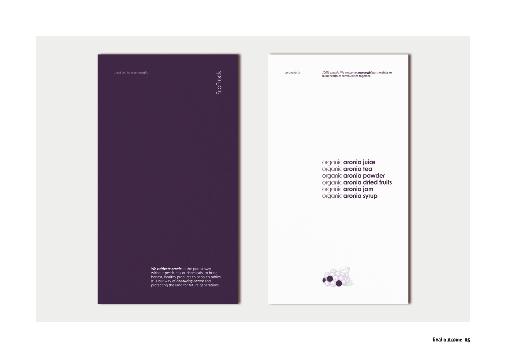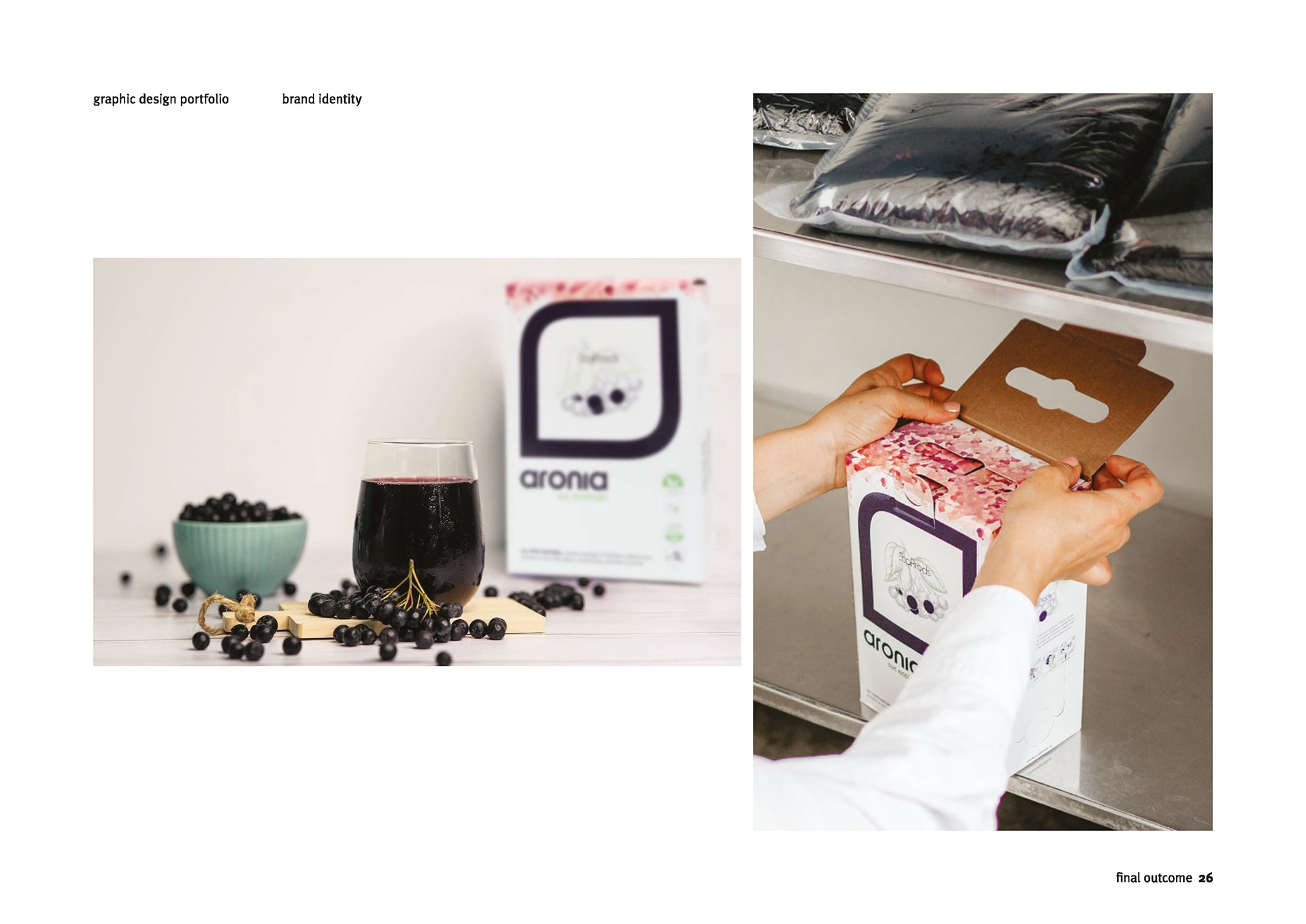
EcoProds
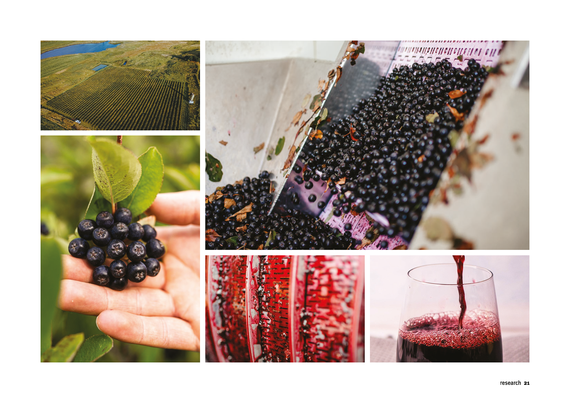
An identity designed for a family-owned sustainable aronia producer, reflecting their values centred on nature, local growth, and eco-friendly practices.
An identity designed for a family-owned sustainable aronia producer, reflecting their values centred on nature, local growth, and eco-friendly practices.
info
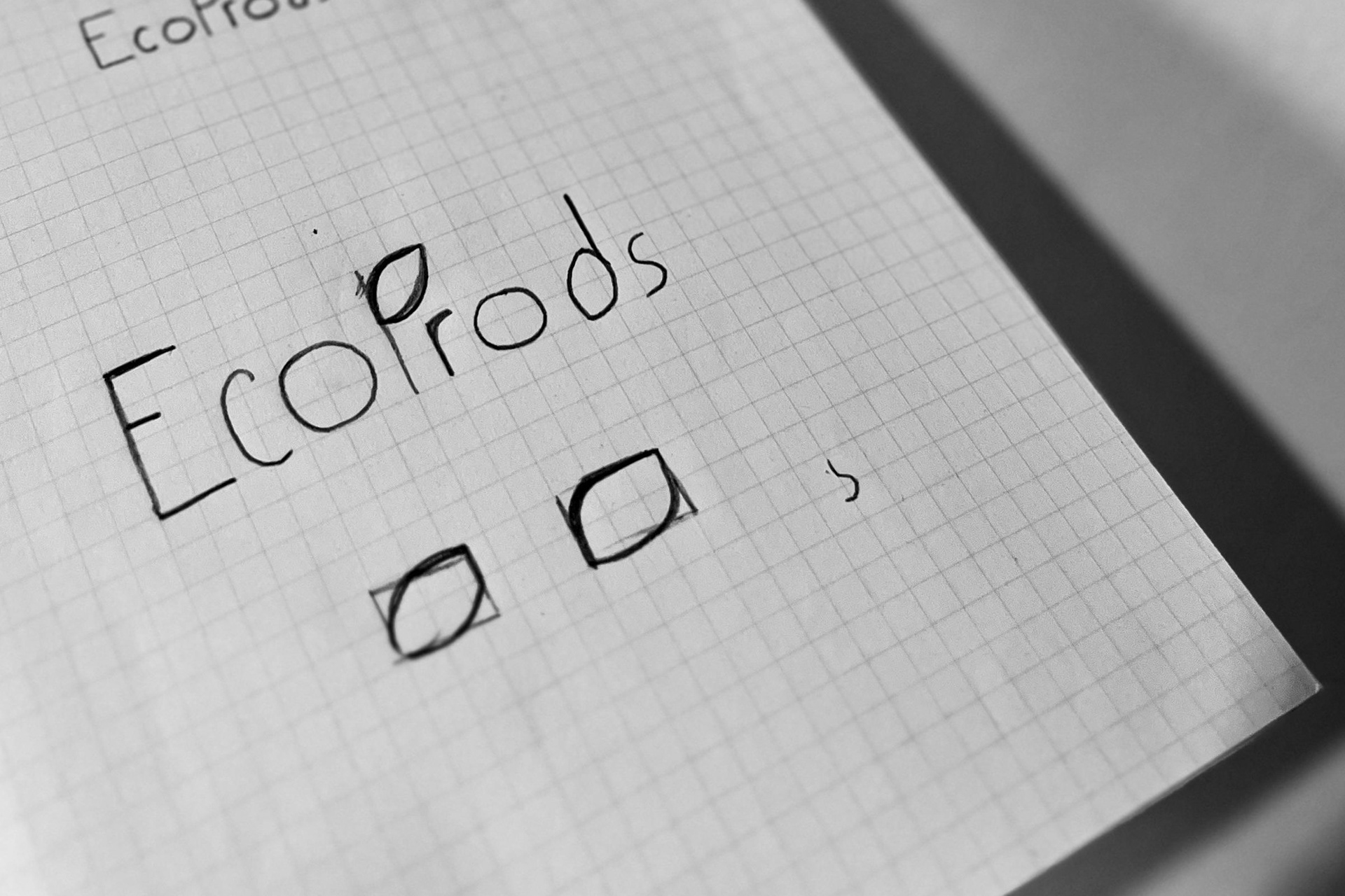
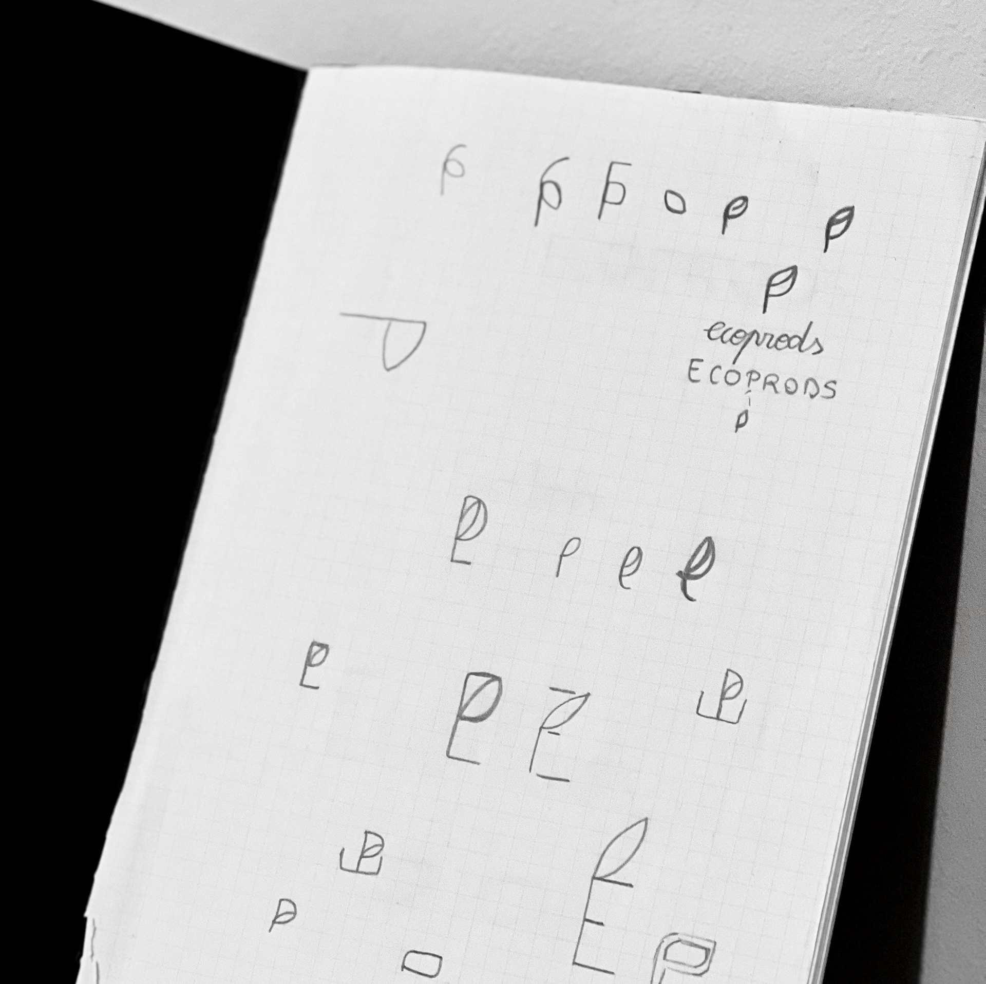
My process began away from the screen, with rough sketches shaped by the brand's story and values — a family dream rooted in a deep love for nature, simplicity, and sustainable living. Their vision of cultivating aronia sustainably, while supporting local producers, guided my direction: a logo that feels organic, grounded, and full of life.
I worked around the idea of a leaf. As shown in the sketches, the leaf is incorporated into the letter 'P' of the brand name to symbolise growth, vitality, and a connection to nature — the foundation from which EcoProds' products come to life. It has become the brand's core symbol, featured throughout its visual identity. The logomark combines the letters 'E' and 'P': the 'E', placed horizontally, stands for eco/ecological and portrays the brand's sustainable foundation and support for local producers. The letter 'P' represents products. Together, they form a name and symbol rooted in clarity and purpose.